I'm no stranger to using ChatGPT for development — a good chunk of the migration of all my apps from Objective-C to Swift, over a hundred thousand lines of code, was done with LLM assistance — but I've been sleeping on the shift that is already well underway in our industry.
A year ago ChatGPT added an 'agents' feature that I handed some programming tasks, like putting together a shell of an Android app that could someday become Broadcasts for Android. The results were interesting, but not really worth pursuing at the time. A lot has happened since then, and tools like Claude Code have started taking over the development processes inside many corporations. I was dimly aware of this, but it wasn't until Xcode 26.3 was revealed, with Claude and Codex integration, that I gave it a shot myself. Honestly, I don't think I knew that Codex was worth checking out until this put it on my radar, around the same time they launched the Codex desktop app.
I spent one month battle-testing Codex 5.3, the latest model from OpenAI, since I was already paying for the $20 ChatGPT Plus plan and already had access to it at no additional cost, with task after task. It didn't just blow away my expectations, it showed me the world has changed: we've just undergone a permanent, irreversible abstraction level shift. I think it will be nigh-impossible to convince somebody who grows up with this stuff that they should ever drop down and write code the old way, like we do, akin to trying to convince the average Swift developer to use assembly language.
All of these experiments below were posted to Mastodon, but there's just so much to talk about that I decided I should summarize it here for the wider world.
TL;DR, this is what I'm going to go through in this post:
- Prototyping multiplatform UIKit apps in Xcode 26.3
- Debugging complex problems in a large codebase
- Converting an entire project in one shot from Objective-C to Swift
- Porting a Swift-based iOS project to Android first as an experiment, then performing a full-on product-quality port of one of my apps
- Migrating a Unity3D game jame game to Swift and SpriteKit
- Generating complex sample documents in an automated way in the Coppice document format
- Beginning work on a full-fat port of one of my big apps to WinUI via the Windows App SDK, while using advanced Win32 features
- Porting Windows Phone 7 apps to a production-ready standard as Windows 11 desktop apps.
I did all of this at the same time as, without AI, reworking, redesigning and shipping Coppice for macOS 26 and the App Store, a 70,000-line app whose codebase was unfamiliar to me.
Outset
I had a couple of questions that I wanted to answer for myself:
- What can I do with this?
- How much is it going to cost me?
This might be a long post, so strap in…
P.S. This post was not written with AI. I use em-dashes liberally. You should too!
Week 1: Prototyping with Xcode 26.3
I was very cautious about trusting Codex with my codebases at first, even in Xcode's sandbox that sees it de-clawed a bit, so I started prototyping some apps from scratch. I needed to see if it could follow my coding style: UIKit, no SwiftUI, no autolayout, no NIBs, with Mac Catalyst support from the outset. To achieve this, I wrote up a 'CodingStyle.md' Markdown file with just a few bulletpoints, with which I could seed future interactions. As I bump into programming choices it makes that I don't agree with, I add them to the style file to try to make sure it does it my preferred way next time. I also have a pre-made minimal Xcode project template that I use for everything I build, so that everything works out of the box and I have my project settings of choice, like warnings-as-errors, on. These two things are the starting point for my initial interactions with Codex.
I took a random project from my long todo list, a 'timeline' app, and progressed it for an hour or two, making sure it had a working data model, could save to disk, and could print or save to PDF. I got exactly what I had envisioned in my head, complete with custom layout containers and controls, and drag-select, when I asked for them. Mac and iPad out of the box. Days, weeks of code in an instant. It dawned on me that an app like this alone, even in this state, could be some up-and-coming indie developer's magnum opus, their first app for the App Store.

I inspected the code and found everything written and structured pretty much as I would have written it. Not hacks upon hacks, not unmaintainable slop, just decently-written 'code'. As average as my own.
How much of my budget did this cost? 7% of my usage limit. An entire app, but a small fraction of my monthly quota.

OK, so Codex can build something that looks like a Mac app using standard UI elements. What about something with nonstandard UI, floating palettes, and a zoomable canvas?
I thought a pixel drawing app could showcase that best.
I coached it into building floating palettes using UIGlassEffect, and into figuring out some complex scroll view code to allow panning and zooming while centering content in the safe area between the two palettes, with overscroll — something I know would have been a nightmare to figure out myself. I ended up with a little layered painting app that can read/write files on disk. I even had it add in some shape-filling tools. If I had spent more time on this, I would have started to polish the UI a bit more — it's pretty barebones as-is — but I was far more interested in the mechanical complexity of this experiment.

Objective-C -> Swift -> Android (SameGame)
I was starting to get more confident in Codex's abilities, and wanted to try it at a more-difficult task. It was at this time that I moved from Xcode 26.3 into the Codex app, just so I could let it do more-drastic things with a project's folder structure.
(Little did I know at this point that I would effectively never go back to using Codex in Xcode itself)
I checked out a ten-year old revision of my SameGame app, written in Objective-C. I had to reach back this far into the repo precisely because I had already rewritten this app in Swift at a later stage, and modernized a lot more of the UI. This classic version had legacy audio APIs, defunct Flurry analytics, and a bunch of cruft built up from its years of progressing from the original iPhone to larger devices, iPad and Mac, and I wanted to see how Codex would handle migrating it to Swift and modern APIs compared to my own.
It performed the migration in one shot. Not a line of ObjC remained, and the app built and ran first time. The audio worked, the gameplay worked, and the custom animated settings screen was intact.
So far, so boring.
What I really wanted to have it try was to port this classic SameGame app to Android, a task that ChatGPT's agent feature had failed at a year ago. So I asked it to port it to Java/XML, gradle and Android Studio, all of which I was familiar with. It asked some big-picture questions, I gave it guidance, and off it went.
I spent two sessions prompting my way through the porting process. I only wish I had taken screenshots of the early builds, as I don't for a second want to give the impression that it did it perfectly all in one go. The game ran, it had some of the right assets, but the buttons didn't work, the logic didn't work, the menus didn't work — but I expected that. At every step, I had it re-reference the iOS codebase, and just refined everything piece by piece. Very soon I had a complete, 1:1 port of this game running on Android. And, to my surprise, it was fully-backwards-compatible all the way to Android 5.0, from well over a decade ago.
This Android version was created from the Swift version that was created from the Objective-C codebase. Two levels removed from the last human-written code. 😯

It was at this point that the reality of what had transpired started to set in. I had to ruminate on this for a while, because I had some big plans for new avenues that were now open to me.
I had intended this to be a throwaway experiment. But now I was looking at a fully-functional version of SameGame on my Pixel 9 Pro, with sound, animation, multiple language support, and more. I figured: this deserves a chance to live.
So I decided that to truly understand the zeitgeist, I needed to ship this to Google Play. It is a zero-risk project; I don't need it to make money, I don't collect tracking data or do advertising. It wasn't 'vibecoded', it was methodically recreated using the iOS source code as a basis. The classic codebase, not on par with the latest version, but a game nonetheless. A harmless experiment.
And so I did.
This would be only the first of several 'production-quality' apps I shipped this month, in my spare time.
Unity3D -> SpriteKit
Twelve years ago, I entered a little project into Ludum Dare's MiniLD50. It was a top-down 2D demake of Quake 3 Arena's capture the flag mode, with crummy developer pixel art. It had bots and AI behavior, network play, and was the gamiest game I ever developed.
But I had long since fallen out of love with Unity, and haven't actually seen this running in over a decade (since the Ouya console, of all things).
Many times over the years I had attempted to resurrect this game, with C and SDL, with Swift, with Godot, and just run out of steam before getting anywhere.
Could Codex figure this out for me? Could a simple 2D Unity project be ported to SpriteKit? Would it even know what to do with all of Unity's various formats and tilemaps and APIs?
The answer: a resounding yes.
It had something I could run in one shot, which was most impressive. Not complete, but upon my first load I was greeted with a functional map with AI bots running around shooting at each other. I spent a night prompting my way through the rest of the bringup process, improving the viewport, making sure the menus and HUD looked right, adding gamepad input and solving a hundred little issues with it.
It just got so much right, and it was trivial to fix the rest; it was a joy merely to play the game again, even if it is to go back on my shelf for now. I posted a notarized build so people could check it out, and I moved on, buoyed by yet another success.

Lights Off for Android
My Codex weekly quota had reset, I had a fresh slate, and it was time for week 2.
I had run out of throwaway experiments to do at this point. I had started pointing Codex at other existing prototypes on my shelf and making little bits of progress on all of them just to close out week 1, but now I wanted to build something for real with the intention of shipping from the get-go.
This time, it would be a port of Lights Off to Android, using the modern, up-to-date iOS codebase. Another low-risk project, I wanted it to use the latest Material Design and do the platform justice.
Lights Off previously had an Android port, back when Android ran on but a handful of devices like the ADP1, written by myself in Java/XML. It was perfunctory, never had any commercial success, and was far more trouble than it was worth to update it for newer devices and screen sizes, so it was left abandoned until Google pulled the plug in a mass-culling of outdated apps in 2016 or so.
I wanted to do better, and with Codex I knew I could.
For the first time, I preserved and shared my side of the entire prompt history, so that others could follow how I was doing this. Only my side, of course, because Codex's answers were full of long bodies of text and snippets of code, but you can get the gist of what's happening. I didn't, sadly, take screenshots of the early part of this process, and waited until I had it in a fully-functional state.
The iOS version was the source of truth, once again. I asked for parity, piece by piece, and would hand screenshots back to Codex whenever words weren't doing it justice. It in particular had to be guided through the process of using Material Design Expressive styles and controls, and I had very little by way of example apps to compare to, as every one of Google's own apps seems to have a different design language. I made sure my layouts switched appropriately between bottom tab bars and navigation rails on larger devices like foldables, and that my colors picked up the user's adaptive Material You personalization settings.
That even inspired me to add a 'Dynamic' game theme that draws its color palette from the user's wallpaper and system theme, which I think produces some genuinely beautiful results. My Rose Quartz Pixel has a pink wallpaper and thus gets a pleasant pink-and-plum-color theme throughout Lights Off.
Over two sessions, an evening and a morning, I had a version of Lights Off using Material Design that I am very proud of. And once again, like every other example here, I did not write a line of code myself. Ready to ship.
You can get it on Google Play today.


Week 2 Prototypes
I was still pointing Codex at various projects and experiments throughout my downtime, bringing things from visual mockups to complete, functioning apps every session. A soundboard app, a storyboarding app, a 'sticky notes' app, and more.

One fun prototype involved a piano keyboard and a PencilKit drawing surface that let you record onto a music sheet, with so many interconnected parts that would have taken me weeks to figure out if I were to build it by hand.
Coppice
All this time, I was working hard on Coppice. A hyperlinked mind-mapping app, originally developed by Martin Pilkington and entrusted to me before he sadly lost his battle with cancer last year, I had been hoping to get it back into a working state, port it to macOS 26 and Liquid Glass, and bring it to the App Store in time for the one-year anniversary of his passing. There is a much longer story here, for another time.
Coppice was the 'day job', while Codex was for moonlighting.
Coppice is a meticulously hand-crafted 72,000 line of code codebase, and that's how I kept it — no AI-written code here. However, I did have some truly gnarly bugs to figure out deep in data model code, and TextKit layout code, that honestly could have stumped me for quite a while — those are critical, complex, hard-to-debug pieces of infrastructure in the app that I didn't want to touch if I could help it. Codex understood the codebase well enough in seconds that it was able to point me directly to the problem areas, and served as rubber duck as I patched my way through them (by hand), which involved migrating the app from TextKit 1 to TextKit 2 and redoing a whole bunch of logic. I had been working on the app for weeks, and even I didn't have enough of that context in my head to zero in on the right places on my own.
I made it over the finish line before the self-imposed deadline, in a big way thanks to Codex.
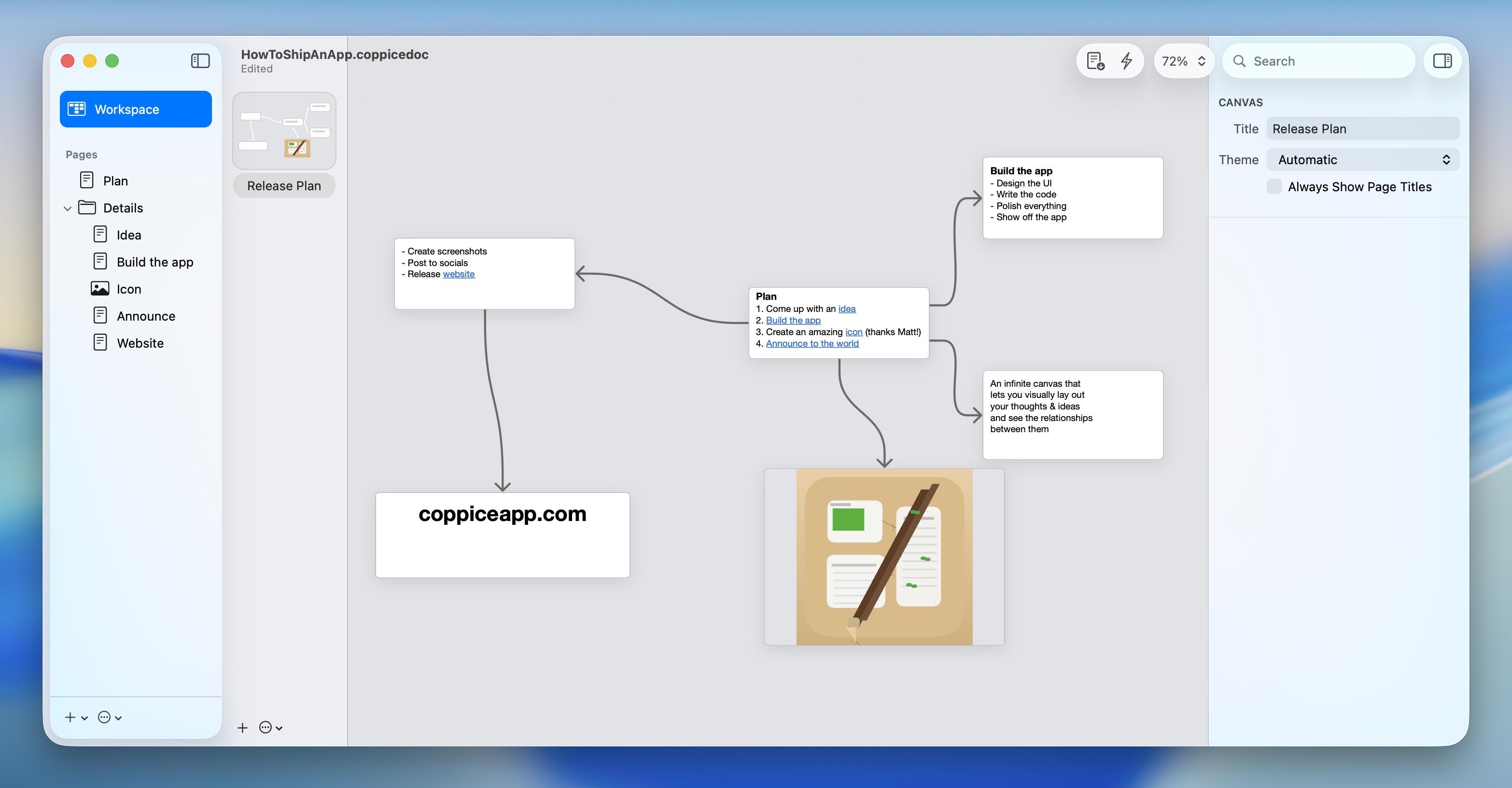
After Coppice shipped, I started to wonder how Codex would fare if handed a sample Coppice document, a format it had never seen before, with no docs, no code, no specs. Coppice documents are macOS-style bundles with files and plists, and I wanted to see if I could use Codex to automate sample document generation.
Its first attempt, which it one-shot, is a bit more like the evidence board meme than a real Coppice document, but rapidly I taught it to refine its technique and it started pumping out documents on various topics of its choosing, with formatted text and color and images and working links and branches. Documents testing links and other features, stress-testing the layout engine, and more, all to provide me with usable sample and debug content.


Once it seemed familiar with the format, I tried something fun: I had a screenshot of a Coppice document in an older version of the app, and I handed it to Codex and told it to reconstruct it.
Once again, it blew me away by doing exactly what I asked it to.
All the pages had the right names, the project structure was intact, the rich text had the right links, the layout was mostly in the right arrangement, and it even drew a picture of its own to insert in place of the one shown in the screenshot.
Just another massively-helpful thing it can 'just do', which at this point was already a long list.
I had it write up a Coppice document portability spec for me with everything it knew, so that I can provide as context to future models, and moved on.

Week 3: Pastel for Windows
Another weekly reset, and an opportunity to try the biggest project yet. I had, some years ago, built a functional mockup of my Pastel app in Windows' UWP SDK, using C# and XAML. I was no stranger to Visual Studio — all my apps had once been ported to Windows Phone, many moons ago, and I had gone through the torturous migration process bringing them to Windows Phone 8, then Windows 8, then Windows 10 Mobile's version of UWP. Windows 11's Fluent design language, and macOS 11, were incredibly similar, and I always figured Pastel would make for a nice-looking Windows app in this style.
UWP though, has long since been deprecated, and Microsoft has a new (and hopefully final) app SDK for building modern apps, combining the best of UWP and Win32 in one hybrid solution, the Windows App SDK.
Let's set aside for a while the fact that 'nobody writes native Windows apps anymore'. When high-quality ports are this trivial, all bets are off.
I had already ported my UWP prototype of Pastel to WASDK, so I had a VS project that could build and run and mostly looked like what I wanted — just without the code-behind to make the app an app. This was my starting point for Codex.
Codex doesn't run natively on Windows as of the time of writing, so I was using the commandline Linux version of Codex in Windows' Linux subsystem. This, of course, proved no hindrance to it.
Pastel is a 70K line of code iOS app. I provided Codex access to a copy of the source code, and once again, set it upon recreating the app piece by piece. For this initial version of the app, I focused on just the core functionality: navigation, data model, context menus, and editing.
The Windows version of Pastel is currently unfinished, but I made a ton of progress. It's currently sitting at about 10K lines of code, but has hit all of the goals I wanted to hit with this attempt. It has a ton of custom UI and drops down to Win32 to perform all kinds of things that needed deeper integration, like its screen color sampling feature. It supports drag and drop from the color swatch in the inspector to palettes, multiple windows, dark mode and more.
I even released a test version for you to try out on the Windows Store. This build is only accessible via direct link (you can't find it on the Store otherwise), and does not save the datastore to disk. There's a lot more to do, and a lot more to come, but for now this is where Pastel for Windows sits.


As a bonus, WASDK can also deploy back to Windows 10, so I ended up making sure Pastel could run OK on that platform too. I don't know yet if some unforeseen issue might arise that would make the Windows 10 version nonviable, but right now it's fully-functional.

Week 3: Lights Off and SameGame, Windows Phone -> Windows 11
As a final act, I wanted to give Codex a chance to port my existing Windows Phone apps to Windows 11, starting with Lights Off.
Now I had both an iOS and an Android codebase for Lights Off, two sources of truth, it made triangulating a Windows version that much easier. In fact, the Windows port leaned on the Android version quite a bit this time as its preferred reference.
This time, I took screenshots of the ugly phases of this port, so you have a better understanding of what those intermediate steps actually look like, in between the 'polished' pictures I'm showing here.
Once again, it took one evening and a morning of prompting and debugging to complete to a quality level I'm happy with, and I've already started the publishing process on the Microsoft Store. Another shipping app I'm proud of.

I began the same process with the Windows Phone version of SameGame, and here you can see the initial bringup, but I haven't yet gone on to progress it to the same quality level as Lights Off.

What did it cost?
I used Codex daily for three weeks, on the $20 ChatGPT Plus plan (I was already paying for this). Not once did I hit the 5-hour usage limit, nor the weekly limit.
There's a catch: for this launch period, OpenAI has been providing 2X the regular usage limits for Codex. Without this temporary increase, I would have hit the limit every week, and would have had to buy extra credits in $40 increments or bump up to the $200/mo plan, neither of which I had any intention of doing.
The fear of accidentally blowing my budget is why I've avoided Anthropic's Claude, and projects like OpenClaw. It was easy to experiment with Codex because it was a 'free' addon under my existing subscription, and honestly the results can speak for themselves.
This temporary bonus will be taken away April 2nd, and I honestly have no idea how its going to crimp my usage of Codex. It doesn't feel great to have my wings clipped before I've reached the sun. The first taste is free…

Conclusion
This story is unfinished; this feels like a first foray into what software development will look like for the rest of my life. Transitioning from the instrument player to the conductor of the orchestra. I can acknowledge that this is both incredibly exciting, and deeply terrifying.
I have perused the source code of some of these projects, especially during the first few days. But very quickly I learned there's simply nothing gained from that. Code is trivial, implementations are ephemeral, and something like Codex can chew through and rewrite a thousand lines of code in a second. Eventually, I just trusted it. Granted, I almost always had a handwritten source of truth, as detailed a spec as any, so it had patterns and structure to follow.
The models are good now. A year ago, none of them could do any of this, certainly not to this quality level. But they don't do it alone. A ton of work went into everything here, just a different kind of work to before. Above all, what mattered most in all of the above examples was taste. My taste, the human touch. I fear for the companies, oblivious to this, that trade their priceless human resources for OpenClaw nodes in a box.
I keep thinking about this:
- I could not have done this without the AI
- The AI could not have done this without me
Another year, another series of incredibly-overpowered new iPads Pro, another round of '…shame the software sucks, though' reviews. But 'sucks' means different things to different people, and it's been a while since I put together an iPad manifesto so I thought I'd delineate where I think iPadOS is dropping the ball or needs improvement specifically from a core OS/developer perspective.
Below are the tentpoles that I think should be, need to be, addressed to make iPad Pro live up to the expectations of its monstrously-powerful M-series chip and multi-thousand-dollar asking price.
Background Tasks
Apps should be able to create long-running tasks, or persistent tasks, that can use meaningful resources in the background as sub-processes. A scripting app like Pythonista should be able to run scripts in a secondary process that, if it crashes, won't take down the host app. Final Cut Pro should be able to export video in the background and let you work in other apps while you wait. Clipboard managers, like Clip, should be able to run in the background without the developer having to build an entire alternative app store and EU-based company to distribute it in, first 😛.
Virtualization & macOS
Bring the Hypervisor and Virtualization frameworks to iPadOS, to run macOS, Windows, Linux virtual machines at full native performance. All M-series iPads support hardware virtualization, and Apple has experimented with this internally for years.
In its most basic implementation, an Apple-provided 'Classic Environment' of sorts that allows you run the current version of macOS, as an app, with the full performance of the CPU and GPU, would go a long way to addressing the shortcomings of iPadOS. This kind of escape hatch can provide the environment necessary to run complex command line software or automation flows, and use powerful missing apps like Xcode, Photoshop, Blender et al. Apple's Vision Pro has its own Virtual Mac Display that many people will tell you is the best part of the entire device, but that still requires a Mac sitting on a table to power it. Both iPad Pro and Vision Pro can, and should, do this with virtualization.
Virtualization isn't the answer to all of iPad's problems, but it provides a runway to let Apple take as long as it wants to evolve iPad's software while ending the 'can this replace my computer?' angst. It also immediately justifies the iPad Pro pricing and strips away the pointless 'them vs us' divide between iPad users and Mac users. If a $3,000 Mac can run iPad apps, why can't a $3,000 iPad do the inverse of this?
The 'future of computing' doesn't begin until Apple's next-gen platforms can run Mac apps.
Windowing
Stage Manager was such a missed opportunity: it tried to bolt-on a windowing model onto iPadOS without providing developers any way to optimize for it, and has had virtually no meaningful improvements in two years. What I really want to see are APIs. APIs to know when an app is running in Stage Manager and give it an opportunity to enable extra functionality to accommodate that — like having an 'open in New Window' context menu option that it would otherwise hide. APIs to set window size/shape, minimum and maximum size. APIs to open a window in split view if possible, with a preferred screen side. APIs to drag a window on mouse-down. Auxiliary views or inspector panels that can be floated on/near a primary window, like visionOS' ornaments.
Many of these features are available as APIs to apps using the iOS SDK… on macOS and visionOS. Which is why it boggles the mind that iPad's own Stage Manager spec completely shunned them, and ignored the explicit intent provided by developers as to how they want their apps to work. Stage Manager wasn't provided as an opportunity to make our apps better, it was inflicted on developers in a way that harmed the developer, and user, experience. Which is why today you can very quickly stumble upon apps that don't quite resize correctly, or have important parts of the UI covered by the virtual keyboard, or toolbars floating in strange places.
Stage Manager needs a rethink, that much is certain, but it's so important not to ignore the developer experience in the process next time round. You can't introduce a windowing model without any developer APIs and then expect robust adoption.
Tabs
And related to windowing, a system-provided tabbed windowing model is so long overdue it's not even funny anymore. Window tabbing is one of the greatest advanced features added to macOS, and it makes even more sense on a smaller device like an iPad. In fact, there are so many cases where you're forced into various multitasking modes on iPad today when what you really wanted was just a few documents open in tabs. macOS has tabs, Windows has tabs — tabs are how computers work nowadays. And on iPad, every app has to reinvent the wheel if they want to implement a tabbing model. This shouldn't be so.
Safari on iPad has a great traditional implementation of tabs, with a zoomable overview mode and the ability to drag tabs into new windows or merge multiple windows together. I would love to see this provided as a system control so that any app could do these things.
Audio/Video
A long-running request: multiple simultaneous audio/video streams and independent audio I/O and volume control. Routing, patching, mixing and recording, to enable apps like Audio Hijack. System audio taps to record audio from all apps. These features exist in iPadOS, but like many of the things on this list, Apple keeps them for its own apps.
Plugins and Custom Extensions
Apps should be able to define new and novel custom Extension interfaces, and vend them to other third-party apps using XPC. A cross-app plugin architecture, with all the system security you expect from a modern OS, with process separation and entitlements. If, say, Procreate wanted to expose a plugin API for third-party apps to provide brushes or special effects, for example, it shouldn't have to wait for Apple to come along and invent that Extension Point first. Or if Delta wanted to expose a way for third-party apps to provide CPU cores to emulate new kinds of vintage games console. Or if a video editing app wanted to provide a hook for custom video encoders/decoders. And so on.
Files
Massively improve the reliability of the Files app infrastructure, including for third-party file services. I should never have to reboot my iPad because an SMB share isn't connecting properly, or a file service is showing stale, cached data. I should be able to reliably copy large files off USB mass storage without random disconnects or corruption. I should be able to choose which app a file type defaults to, and open it immediately in that app without going through the QuickLook -> Share -> Open In… dance. Files is one of the weakest aspects of iPadOS, and quite simply those of us who use it regularly just don't trust it to work.
Full Disk/Filesystem Access & APIs
When iPad was introduced, Apple tried to kickstart a new era where files and folders didn't exist, where everything was stored in app silos, and users were kept in blissful ignorance. But it's clear, fourteen years later, that files and folders are still incredibly important to computing, especially in the kinds of workflows one might be purchasing an iPad Pro for. iPad now has long had a Files app, it supports USB Mass Storage and network shares, and even reads/writes files/projects to physical media in Apple's own pro apps like Final Cut Pro. But there are a whole host of things iPad cannot do that are very important for dealing with storage volumes, like formatting drives, verifying filesystems, repair, recovery, and backup. If you want to use a mass storage device with your iPad, better bring it to a 'real computer' first to prepare it.
JIT
Just-in-time compilation is essential to power things like web browsers, console and PC emulators, and language-based virtual machines. It is used by Apple's own apps, like Playgrounds, to empower key functionality that no third party app can match. And it is provided in a very limited way (with a ton of asterisks) to Alternative Web Browsers in the EU under the DMA, so they can implement their own JavaScript engines. The DolphiniOS project, which emulates Nintendo's GameCube, recently posted a video that perfectly encapsulates the problem and demonstrates why emulators for newer consoles just can't come to iPadOS. Other app stores, like Microsoft's Windows Store, offer a JIT entitlement as standard, and I think Apple should, too.
Local App Compilation & Installation
It's 2024: there needs to be a way for an iPad-based IDE to build and deploy a full app, locally, to the home screen. This is the kind of thing that Apple does in its own Playgrounds app, a key unfair competitive advantage versus any other IDE or programming language. This functionality should be exposed such that third-party developers can do something similar. Compilation, in most cases, relies on also having access to JIT (above).
I'm not saying that an app built using these mechanisms should sidestep any system security, but there should be a golden path that lets you build, validate, sign/notarize, and install (on your device only, perhaps) built right in to iPadOS. If that flow involves a step that uploads your binary to Apple to scan it for malware, or whatever, it doesn't matter — just make end-to-end app development, in other IDEs and languages, not only possible but feasible.
Currently, the only way to do this on iPad is with Apple's Swift Playgrounds. The only language it lets you use is Swift. And the only distribution mechanism you can choose from there is Apple's App Store, which locks you in to giving Apple 15/30% of your revenue in perpetuity. No other app is allowed to do these things, both by policy and by technical restriction. Do you see the problem here? If that's not anticompetitive, I don't know what is.
The Menu Bar
iPadOS has a system shortcuts panel filled with keyboard commands in all your favorite apps, but its discoverability is really low — hold the Command key, with a hardware keyboard attached, and it will pop up. This panel is completely hidden to users relying on the software keyboard.
So much high-end iPad software ends up hiding its advanced functionality behind mystery-meat multi-finger gestures, when really what would be helpful is a persistent menu bar at the top of the screen. The menu bar has always served as a teaching tool on the Mac, where you can go and explore to see what functionality an app might have.
Stage Manager already has UI to enable/disable the sidebar and the Dock — an extra option that shows/hides a system menu bar in the same way would fit right in. So wouldn't it make sense, then, to have a system menu bar in Stage Manager mode? Even if it's only shown on external displays, where space isn't at a premium.
And perhaps too it would make sense to have system shortcut keys — control, alt, command, etc — on the virtual keyboard. This is something Windows does, and it works well.
Both of these features could help iPadOS scale up to larger screen sizes, on larger iPads perhaps (15"? yes please), without taking anything away from the existing experience.
Help
iPadOS, and iOS for that matter, should have a built-in help system. macOS has a legacy Help system that is dated, badly documented and a pain to implement in your Mac apps — so I'm not suggesting that it be ported over to iPad. But I think it's long past time for a new, modern Help API across all of Apple's platforms that makes it easy to provide documentation in-app. Straightforward to write using HTML and Markdown, support for SF Symbols and localization, with dedicated creation tools built in to Xcode.
I feel so strongly about this that I wrote my own, for Broadcasts.
There is so much more to write about iPad Pro, but I will leave that to better people. iPad has been my favorite platform and form factor of choice for fourteen years, but the software feels like it's stuck in molasses. You can summarize every iPad review for the past decade: iPad hardware is writing checks that its OS simply can't cash. iPad silicon has so rapidly outgrown the limitations of the software that it has had ample time to break out and do three generational laps through the entire Mac lineup and back since the last time I wrote about it, and yet little has meaningfully improved about the iPad experience.
I don't think that's tenable — not for iPad, and especially not for Apple Vision Pro, which, as it runs basically the same OS and software stack, is subject to all the same limitations and problems as iPad and more. Now, more than ever, is the time to break the mold and take iPad to the next level; the future of computing depends on it.
The transition to Apple Silicon brought about many exciting things, but one of the capabilities left behind was access to the world of Intel-based virtual machines. X86_64 just isn't a trivial architecture to emulate, and it may never be feasible to do so on Apple Silicon at a useful speed as the operating systems you wish to run gain more and more complexity and become more and more demanding.
You have plenty of great options for emulation, like UTM, but the performance penalty is significant, and that rules out many use-cases.
I have always used virtual machines as my window into the past. I started emulating Windows 95 via Connectix' Virtual PC a lifetime ago, and in my teenage years explored the exciting years of then-lost alternative operating systems, like BeOS, OS/2, NEXTSTEP, as well as keeping vaguely up to date with Microsoft's doomed 'Longhorn' experiments. Apple's transition to Intel in 2006 opened up whole new opportunities, and spawned VMware Fusion and Parallels for Mac. VMware in particular provided a great, Mac-like experience that really resonated with me, and I've used the app ever since.
But say you are somebody who has used VMware Fusion on their Mac for a while — you might have a library of virtual machines you need to preserve for various work or productivity-related tasks, like a Windows 7 install with Microsoft Office, or Visual Studio. Or you're a Mac developer who needs to be able to run an older verson of macOS to test the backwards-compatibility of their apps. Now, you've just bought a brand new Apple-Silicon-based Mac, and there is just simply no way to run your VMs any more. VMware no longer boots anything under Rosetta, and the VMware Fusion Apple Silicon preview only supports virtualizing Linux as Microsoft's licensing story for Windows on ARM does not include the Mac.

There is, however, another way.
VMware have an enterprise-level operating system called ESXi, which is a bare metal hypervisor. What does that mean in practice? If you have a spare PC and Ethernet, you can install ESXi as its OS, configure it over the network through a web browser, and have it become the dedicated engine that runs your VMware virtual machines. With VMware Fusion Pro, you can connect to that ESXi machine via its IP address, and then be able to run/manage your virtual machines mostly the same as when you could run them locally. VMware Fusion Pro is not free, though if you've been keeping up to date over the years an upgrade license is about $100. ESXi itself offers a free license for home use. To be clear: you can run and control your VMs entirely from ESXi's free web UI, if you don't want to pay for Fusion Pro, and/or use the built-in Screen Sharing or Remote Desktop features of your guest OSes instead.
Not all features of VMware are supported in this manner. You can't use the 'Unity' mode to interleave your Mac and Windows apps, or use the quick launcher menu, for example, and there are quirks like getting black thumbnails for suspended VMs. I found VMware Fusion also tabs windows, which is annoying (fix). It's also kinda frustrating that all the VMs on ESXi are provided as a flat list, with no way to group them or put them in folders — but that's a first-world problem for people with a ton of VMs, not your average user.
What you do get, though, is near-native performance, without taking up any of the resources of the Mac you're working on. Most of the same configuration and management UIs are available, but for those that aren't there is always the browser-based management interface to your ESXi box, which has tons of advanced settings beyond anything VMware usually exposes. You can boot, shut down, suspend, add, delete VMs remotely. You can drag and drop your existing VMs to the server. You can even stream local disc images from VMware Fusion to the VM on the server. Really, the only tell that it's coming over the network at all is a little bit of h264 compression when things are in motion.

One advantage very specific to the low-level way ESXi works, because there's no underlying operating system to get in the way, is the ability to 'pass through' real hardware to the virtual machine — say a specific network card, or a USB hub. Or most importantly for macOS: a GPU. If all you want to do is run Windows or Linux, no need to read on — life is easy.
Things get technical below.
Preamble
From what I gather ESXi has multiple web management interfaces: the free one, and the expensive VSphere/vCenter Server. Trying to figure this stuff out from the VMware website as a home user is near-impossible: it's completely obtuse, enterprise-focused, and there's no ELI5 option. Almost everybody writing about this topic is using the non-free UI, because they are virtualization professionals. I am not; I have used the basic, free UI for everything — so while the pre-existing guides all still apply, the location and wording of the options is slightly different. Use them to inform you, but be prepared to learn as you go. I had to piece together a whole lot of disparate blog and reddit posts to get this set up the way I want, and now that I have I just want to record it all here for posterity (and so I don't have to keep it in my own head, either; 🧵 Twitter thread). Once you've done everything once, the rest is trivial.
Virtualizing macOS
ESXi has the same ability to run macOS VMs that VMware Fusion has, with an important caveat: this only works out of the box if you have ESXi running on a Supported Mac, like the 2018 Mac mini, or a pre-2019 Mac Pro (both of which are still available from Apple.com for the time being). If you have a spare Mac mini, great!
I, however, decided to base my ESXi server on an Intel NUC, a little PC barely much bigger than a Raspberry Pi. Specifically a tenth-generation NUC10i5FNHN in my case; I chose a tenth-generation NUC because from what I read, GPU passthrough wasn't fully working on the NUC11 (yet?), and there is precious little information to go on out there to try and figure out if that situation has changed. All of its hardware seems to be fully supported in the latest versin of ESXi, including onboard networking. You can also buy a whole lot of NUCs for the price of a Mac mini, and they all have upgradable NVMe, RAM, and a 2.5" SATA drive slot, which are huge advantages over most Macs.
While this is not a tutorial, I wanted to link to the sources I used in putting together my setup. In particular, this guide runs through almost everything I needed to get macOS running — use it as a starting point, then come back, because I go beyond below.
There are a couple of elements to running macOS in ESXi on non-Apple hardware:
- Turning off Secure Boot on your ESXi PC to enable the running of scripts and modification of the OS
- Patching ESXi using esxi-unlocker
- Creating an ISO from any given macOS installer
- Creating the macOS virtual machine
- Providing some extra properties (like a real Mac's serial number) to enable the Mac App Store, iMessage, etc
- Installing and setting up macOS
Apple helpfully provides an entire library of legacy versions of macOS as free downloads — How to get old versions of macOS. However, except for macOS 11 which has Apple Silicon support, most of them will need to be downloaded on a supported Intel Mac. From those downloads, you will create the ISOs as per the linked guide — they can't be booted as-is.

Passthrough Graphics for macOS VMs
Additionally, if you've ever used a recent macOS in a virtual machine, you will be keenly aware at how badly it performs without graphics acceleration. If you have a supported Mac running ESXi, like a Mac mini, this part is easy; check out this guide. But in short:
- Ensure networking is set up in your VM
- Enable Screen Sharing (because you will no longer be able to interact with this VM via VMware Fusion when the graphics card takes over the display)
- Turn on passthru for your graphics chip using the ESXi web UI
- Add a 'PCI device' to your VM, with the ESXi web UI, and point it at your passthru graphics chip
- You should use the VMware Tools to set specific resolutions for the VM, if you want Retina/HiDPI.
If you're on a Mac mini, you might be done here; simply wait for your virtual machine to show up in the Network list on your own Mac, then connect to it via Screen Sharing like you might any other machine.
Guides mention some extra passthrough options through the VSphere interface that I can't find in the free UI, but from what I've gathered almost everything is available through the ESXi shell if not exposed in the web interface. Again, you will find bits and pieces of this documented in random helpful blog posts.
I can't remember if this was important, but I set it and forgot about it:
esxcli graphics host set --default-type SharedPassthru
Note also this command from the guide linked earlier, which stops ESXi from automatically claiming the GPU/display for itself at startup:
esxcli system settings kernel set -s vga -v FALSE

Unsupported GPUs
The GPU in the NUC10 I'm using isn't natively recognized by macOS, so, after a lot of experimentation, I opted to put together a secondary disk with the Clover bootloader that injects a series of kexts (FakePCIID) that spoof the device ID such that macOS will light it up. I had to add the NUC10's graphics chip's device-id into the Info.plist in the couple of kexts, and modify the Clover config.plist with the right vendor and framebuffer IDs. The Clover config also specifically spoofs a 2018 Mac mini model ID. Almost all the Hackintosh-specific guides I found told me to use OpenCore instead of Clover, and Lilu/WhateverGreen, but I had precisely zero success with this in ESXi and wasted a day along those lines of exploration.
If that sounds way over your head, don't worry: this disk image, now I've made one, is pretty much standalone, in that I can copy it into new Mac VMs and boot from it and accelerated graphics will 'just work'. It doesn't otherwise screw with macOS or require any weird modifications, and shouldn't get in the way of software updates.
Ready-made disk: 💽 Clover-ESXi-NUC10-PassthroughGPU-BootMe.zip (67MB)
- Attach ready-made Clover disk as hard drive 2 to the VM
- 'Power On To Firmware' in VMware, Enter Setup, and change the boot order to boot from drive 2 first
- Boot!
- [Optional] Edit fstab inside the macOS VM to prevent the 'msdos' Clover disk from mounting at boot. Out of sight, out of mind.
If your ESXi PC has PCIe slots, or an eGPU enclosure attached over Thunderbolt, you could just as easily find a fully-Mac-compatible GPU to dedicate to your VM, or even one for each… (down this road lies madness). There are some undocumented ESXi options that might help.

Virtualizing Mac OS X 10.4 "Tiger"–10.6 "Snow Leopard"
"Lion" 10.7 was the first client verson of Mac OS X that was officially supported in VMware, without any hacks. Mac OS X Server 10.5 and 10.6 were supported, but not the consumer releases. As a result, there are some additional steps to follow to get older versions to boot. In summary:
- Add the extra properties to your VM config as above
- Find and copy
efi32-srvr.romandefi64-srvr.rominto your VM's container with ESXi's Datastore browser - For Tiger, use the efi32 variant as per the steps linked above. For Leopard and Snow Leopard, use 'efi64' in place of 'efi32'.
As an aside: if you have an older Apple Developer account, your 'More Downloads' archive may still have Universal Intel/PowerPC disk images available for 10.4.7 Server, 10.5.0 (9A581), and 10.6.0 (10A432), if you don't really want to trust random ISOs from the internet. Once set up, Mac VMs should have no issues installing OS updates, so you can patch them up to latest.

Conclusion
Moving my VMware Fusion collection to ESXi and getting it set up just right has been a marathon, but I'm so glad I did it. Not only does this bring my VMs with me into an Apple Silicon world, but it also opens up new opportunities like running fully-graphics-accelerated versions of macOS for testing my apps. The NUC is small enough to squirrel away somewhere, but powerful enough to run virtually any Intel-based OS I want. In fact, since there is now a preliminary version of ESXi for ARM (which can run on Raspberry Pi 4, no less), you could even expose ARM-based operating systems, Linux or Windows-on-ARM, to an Intel-based Mac, and have them listed alongside the rest of your VMs in VMware Fusion Pro.
At least now I can comfortably work on Apple Silicon without losing my VMware library.
✌️

When the first UIKit-based apps appeared on macOS Mojave, it was abundantly clear that there was a long way to go before this technology was appropriate for developers making new Mac apps. With macOS Catalina, this initial half-step was put in developers' hands, and it took quite an effort to wrangle it into something that looked and felt like it fit on the Mac. As we transitioned through macOS 11, however, and the introduction of the 'Mac Idiom', UIKit crossed a threshold that now makes it a great way to build Mac-like Mac apps. Most users would be hard-pressed to tell that the Messages, Podcasts, or Maps apps are anything but robust, native Mac apps, and though that level of quality is not evenly distributed amongst Apple's other UIKit-based Catalyst apps, it provides a great baseline for expectations of what you can achieve with Mac Catalyst, if you put the effort in.
However, this piece is intended to explore the parts that don't work as-is; having now used Mac Catalyst to build two successful and highly-rated medium-complexity Mac apps in Broadcasts and Pastel, and having spent the past year or so building sample code for developers, I wanted to take some time to lay out the areas of the framework that I've found just don't do enough to enable great Mac apps, and perhaps provide a checklist of things for Apple to solve in future versions of the OS. This is my curated list, and there will definitely be things I didn't touch upon below as they haven't directly impacted what I'm working on or hoping to build. Onwards!
Document-Based Apps
The biggest glaring hole in UIKit on macOS is its handling of document-based apps. There are many reasons it falls flat, but let's start with the basics: Xcode's 'Document App' template for iOS crashes on launch when you add Mac Catalyst support, because it lacks the basic entitlements for opening files. Even after fixing that, and adding the requisite document types in its Info plist, actually trying to open a file will send the document browser into an endless loop of showing the file picker. This alone might be the instant death of a potential document-based app, because even experienced developers will suddenly be lost at sea trying to patch the built-in template to run as expected.
Assuming you've got past this point, or have an already-well-built document app on iPhone or iPad that you're just flipping on 'Mac' support for, you'll rapidly find that you have to ifdef and special-case your way around the behaviors that just don't do the right thing on macOS, because UIDocumentBrowserViewController is at the root of your layout. And then you discover elements like the 'Open Recents' menu just don't work by default, and present a save panel instead. Or that a blank window is shown when you launch the app but before you have chosen a document, because UIDocumentBrowserViewController needs to be embedded in an existing window and can't show a picker independent of that.
This Xcode template isn't even updated for window scenes, so even if it did work it wouldn't support multiple documents, window tabbing, or anything you might expect from a document-based app on macOS.
UIKit's document browser, which is set as the root view controller of a window, just isn't appropriate in a world where file pickers are independent of the app window, and where there should be no windows at all before a file has been opened. If you do manage to get yourself through all of this and out the other side, you'll most likely have replaced all of UIKit's document picker handling with platform-specific open panels you trigger manually, and perhaps even a complete rewrite of UIKit's document system itself.
No Apple app is dogfooding this aspect of Catalyst, and it shows. If Apple internally were to create a multi-window document editor app, like TextEdit, in Catalyst and just fix everything they ran into step-by-step along the way such that it functions identically to the AppKit version, it would go a long way for all of us. Unfortunately Swift Playgrounds just doesn't touch any of this stuff because of its silo-based nature & Xcode-based editor, so it doesn't seem like it can drive any of these improvements.
Preference Windows
Catalyst brought support for iOS Settings Bundles to macOS, which Apple has even started using in its own non-Catalyst apps (like the iOS Simulator), however this system is, as on iOS, incredibly limited and static — which is why almost every app rolls their own settings window on iOS. User account registration, in-app purchase, and things like themes or alternative icon sets all require a kind of settings UI that just isn't possible with a Settings Bundle.
If you dig in, you will find that Catalyst gives you all the tools you need to build a settings window using the UIKit window scene APIs. I have sample code that demonstrates just that. However, there are still missing pieces:
- You have no control over the window buttons in Catalyst (without bridging to AppKit), so you can't denote a window as non-resizable to disable the green traffic light
- UIKit windows all use state restoration, which means if you quit the app while the settings window is open, it will pop up again the next time you launch it. No Mac app does this
- There is no easy analog to NSTabView, which you will find in the preference windows of most Mac apps. While not critical, it is conceptually important & contextually-relevant
Overall, you can get 90% of the way there if you fall back to AppKit bridging to patch around the rough edges. However, it would be great to have all of this stuff work out of the box.
Menu Bar Extras & Menu Bar Apps
The number one user request in my apps, and the number one topic I've been asked about from developers over the past two years, is all about putting UI in the menu bar. Everybody, but Apple, it seems, wants apps to support the Menu Bar status area with indicators, menus and UI. In many cases, iPhone developers coming to the Mac have an app that would be great pinned globally to the menu bar, but kinda pointless as a window floating around your desktop that has to be managed by the user.
There simply is no concept in UIKit that can address this need, currently. I came up with my own method of doing this for Pastel, which is provided as sample code, but it's very clear that there needs to be some officially-sanctioned way of putting UI into the menu bar. Whether that's with a new popover presentation mode similar to mine, or a bespoke Menu Bar Extra App Extension, it really needs to be an option in the developer toolbox. Because none of Apple's own apps do this, and it's far enough off the beaten path, I don't see them adding this without significant developer feedback. It's the developer who is going to get hit with negative reviews when their app doesn't support this staple of the Mac user experience, and Apple sees none of that.
Mac-style Table & Collection Views That 'Just Work'
While I appreciate the new configuration APIs added to UICollectionView to perform the function of a regular table view, unfortunately by default they just don't give you a table view that works as expected on macOS. You'll be hundreds of lines in just trying to match the basic behavior one might expect from an AppKit NSTableView, with selection and inactive states, and completely on your own when it comes to type-select or more-esoteric AppKit-wide keyboard shortcuts. Beyond that, UICollectionView in general just doesn't have the mechanics to understand the distinction between a click, double-click, touch, keyboard trigger, or stylus touch — they're all just 'a selection'. macOS, and arguably iPadOS, needs to be able to customize selection/actuation behavior for the mouse, so that you can do things like have a single-click select something, and a double-click opens/triggers/actuates it, but not have that interfere with touch-based selection.
Similarly, clicking on a list or collection view should have an option to take keyboard focus, like it does in most Mac apps. When you select a file in Finder, you expect the keyboard to follow you so that you can then use arrow-key navigation and the like without first having to hit the tab key to move focus to the icon view; by default, UICollectionView doesn't work like that in Mac Catalyst, which affects both table-view-style lists and grids. UICollectionView does have a _shouldBecomeFocusedOnSelection property that just isn't exposed to developers, but solves a whole bunch of lingering behavioral issues on macOS, and I would class it as a must-have public API.
Of course, the elephant in the room is multi-column table views, an essential, core part of many desktop apps, and a topic completely ignored by UIKit and thus completely unavailable to Catalyst-based Mac apps. I really hope to see an API for this at some point in the future, but for now it's more of a wishlist item.

Toolbar Views & Customization
One bridge to AppKit that Apple did decide to give UIKit developers is NSToolbar, so that they have direct control of how their app's toolbar behaves. Unfortunately, only a subset of NSToolbar-related functionality is bridged, which means you'll have to start using your own AppKit bridge if you need things like a search field, for example, or custom-drawn views like a Safari-style URL field, volume slider, or where you want a manually-specified fixed size. Presenting popovers from toolbar items is also impossible without a bridge, despite Apple apps like Maps doing so.
In Broadcasts, I went the other direction and use UIKit to 'fake' a toolbar, similar to that used in Podcasts. In Pastel, which has a search field, I had to use an AppKit bridge to handle that functionality. In Flare, my simplistic browser sample code, I go as far as subclassing AppKit classes to draw a custom address bar with a favicon area. It's great that all of these avenues are open to us, as developers, but boy would I like to just be able to use UIKit views in my toolbar area and have them work as expected without any of the bridging and glue code. In Apple's own apps like Messages and Podcasts, they have eschewed NSToolbar in favor of faking it using UIKit, but there are two aspects of that that complicate things for developers:
- There is no way to change the titlebar height using public API, so that the window controls are positioned correctly based on your custom toolbar height
- Apple relies on a non-public UITitlebar titleVisibility mode (of 'transparent'), such that mouse actions in that area are correctly passed to the UIKit controls underneath
Without those two things, which, granted, you can try in your own apps if you're brave enough to risk App Review, using UIKit in place of an NSToolbar just isn't viable for most developers, which leaves us bound to a partial NSToolbar API subset.
Window Controls
There are many aspects of window behavior that just aren't exposed through UIKit right now, like the ability to disable the window buttons or fullscreen mode, change the titlebar transparency, or modify the titlebar/toolbar area size — or even set the window frame/position onscreen, or save/restore it on quit/relaunch. The side effect of this is you'll find app windows, like preference panels, that let you fullscreen them when they shouldn't, or non-resizable windows still having an active zoom button, or windows forgetting their sizes when restored. Not having access to all these aspects of NSWindow is severely limiting, as a developer, and leads to a worse user experience.
My opinion is that a Catalyst developer should have a way to control every aspect of the UI they present to the user — and the window & window chrome is one of the most important parts of the app. The way Catalyst works, every UIWindowScene is wrapped by an NSWindow subclass that handles a bunch of implicit behavior, but the bridges to control its presentation are just too simplistic.
Inspector Panels
Inspector panels was one aspect of AppKit bridging that was originally touted, unofficially, as an option for Catalyst developers. However, there just simply is no way to get UIKit-based content in such a panel window. Even if you were to go to town with the swizzling, the base UIWindowScene class is always mapped to an NSWindow subclass, which leaves all of the NSPanel-based functionality locked away from you. All of the other issues with window scenes as mentioned above also make such a task pretty difficult to fake, too. Panels in macOS can do things like float above other windows in fullscreen, be 'non-activating' so you can interact with them without losing focus of the main window, and hide themselves from Exposé and Mission Control. Not being able to set, save or restore their frame would also be problematic.
You can, of course, build and maintain a separate AppKit-based view hierarchy to power an inspector panel, but that introduces far too many issues for most developers to bother with it, and bridging back and forth to the UIKit portion of your codebase is an ordeal.
I think the simplest way to solve this is to provide some kind of modal presentation mode that lets a UIKit app spawn a view controller as an inspector panel, much like it does today with popovers. Most of their behavior can be implicit, anyway, as long as they behave like an inspector panel should.
(Aside: If you got to the end of this section without an 80s theme song stuck in your head, I envy you)
Window Dragging
In AppKit you can allow the window to be dragged when you start dragging in certain views, or disallow it from others. Open a video in QuickTime, for example, and you'll find you can drag the window around from anywhere in the playback area. Video playback is a good example of a window type in which you might want such an interaction. Catalyst does indeed have such functionality as private API (UIView's _sceneDraggingBehaviorOnPan flag), and I think it could be a good candidate to expose to developers.
Scaling Primitives
There are two forms of Catalyst, on macOS — iPad Idiom, and Mac Idiom. In the iPad Idiom, all of your metrics are shared with iOS, and the end result is rendered at 77% scale on the Mac, leading to blurry text and sub-standard output on non-Retina monitors. In the Mac Idiom, which is only available to macOS 11 and up, you get 1:1 pixel scaling and a UI experience that leans into AppKit for quite a lot, like native buttons and other controls. However, beyond the most basic changes to padding in Interface Builder and SwiftUI, your layout is going to need a ton of work to be able to run in both modes without a million ifdefs, and you're really left out to dry here.
Because all metrics in Apple's platforms are expressed as points or pixels, not real-world physical sizes (like inches or mm), there is no system-provided solution to handle multiple UI scales like this. A number is just a number; it can't vary per-platform.
The first thing I do in all my Mac Catalyst projects is drop in a little wrapper, which I call 'UIFloat', that does the scaling for me based on whether the app is running in the Mac Idiom or not. Then, everywhere across my project that I manually specify a layout point, rect, layer corner radius, or a font size, I wrap its components in UIFloat(). So instead of having raw numbers in my project, I have UIFloats instead. I know instantly if it's a number that is intended for something UI-facing, and I can also tell instantly if I forgot to vary it for macOS. This has been the magic solution that makes complex UI like Pastel's really straightforward to maintain between iPad and Mac such that I don't ever have to think about it anymore. Not having this would be a significant impediment to the adoption of the Mac Idiom, and I'm certain has turned off plenty of developers making this journey for the first time — leaving them to settle with the iPad Idiom, blurry apps, and iOS-like buttons and controls. It's also a great solution for SwiftUI, as more and more layout moves away from Interface Builder and to code.
Upgrade Cycles & Backwards Compatibility
This is not a problem unique to Mac Catalyst, but it has now become a problem with building apps for the Mac:
- TestFlight is only available to macOS 12
- There is no way to virtualize macOS 11 on an Apple Silicon Mac
Combine these two issues, and you end up with apps that, if they bother to support macOS 11 at all, have severely limited options for testing. With Broadcasts, my TestFlight tester list has thousands of users, and I can ensure that they all get to try a version of the app that exactly matches the App Store build. Not one of them is able to test on macOS 11, because Apple made the bizarre decision to link TestFlight tightly to macOS 12. As my development machine is on Apple Silicon, and thus cannot run any version of macOS before 12.0 in a virtual machine, the only macOS 11 testing device I have is a ten-year-old MacBook Pro that had to be hackintoshed(!) to run the OS. With the much more protracted upgrade cycles on macOS, where users (and developers) can delay OS upgrades for many months, even years, no Mac developer can afford to simply target the latest version of macOS and cut compatibility with something merely a year old. TestFlight has no good reason whatsoever to be limited in this way, and for frameworks that undergo so much change every year like Mac Catalyst and SwiftUI, you just can't expect something you write today to run on an older version of macOS without rigorous testing & debugging. These problems will go away with time, of course, but you're still talking years before dropping support for macOS 11 becomes non-controversial.
Personally, I think it's long past time we had a 'macOS Simulator' along the same lines as the iOS Simulator, such that you can boot up any given version of macOS and run your app directly from Xcode against it. It should be just as easy to build & run an app from Mac to Mac is it is from Mac to iOS device; as more and more iOS developers come to develop for macOS, these outmoded parts of the developer experience really highlight their age and their disconnect from modern app development.

Conclusion
Mac Catalyst is in a great place; it has improved substantially every year since its introduction, and for most developers it is by far the best way to build great Mac-like Universal apps that run across iPhone, iPad and Mac. Its hybrid nature allows a developer to pick and choose which elements of UIKit, SwiftUI, and AppKit they need to achieve the experience they're looking for, or combine them all for the best of both worlds. It clearly has a lot of traction inside Apple's product teams, as it's become the enabling technology for Messages, Maps, Podcasts, Find My, Playgrounds, Books, Voice Memos, Stocks, Home, and News. Paired with SwiftUI, it's rapidly becoming the defacto standard for new Mac apps on the App Store, for better or for worse — all the more reason that the remaining rough edges be given priority. Each one of the remaining barriers just gives a developer reason to avoid trying for that extra mile, relying on the iOS behavior they know and that works.
If you've kept your distance from Mac Catalyst because of negative experience with first- or third-party apps, or merely clicked the 'Mac' checkbox in Xcode and never really dug in to what's possible beyond that, you're really missing out. Three years ago when these discussions first came about, this was mostly theoretical, but now with three major projects, four minor, a dozen prototypes, and a whole bunch of sample code under my belt, I can safely say that I expect Mac Catalyst to power my next decade on the App Store, and beyond. Very few of these apps would exist if I had to build & maintain bespoke Mac versions, in AppKit or in SwiftUI, and I certainly wouldn't be able to keep them up to date and at feature parity release after release.
I thought it would be a good idea to round up the various pieces of sample code I've created for Mac Catalyst just to get everything in one place. These are by no means step-by-step guides, merely illustrated examples that have come about over the course of developing my own apps and responding to questions from developers.
No license or attribution is required for any of these codebases. Most, if not all of them, require macOS 11. While Catalyst is present and supported in macOS 10.15, it lacks the Mac idiom (Optimized for Mac) which renders some of this optimization for macOS moot.
Preference Windows

CatalystPrefsWindow showcases how to add a SwiftUI-based preferences panel to your Catalyst app, using a custom window scene.
Translucent sidebars in SwiftUI

CatalystSwiftUISidebar demonstrates a way to wrap UISplitViewController in SwiftUI to get a translucent sidebar in your app.
Advanced three-column app shell & search toolbar item

advancedcatalystexample — I took the core of my new app, Scarlet, and rewrote it as an example app. It shows one method of building a three-column app, and includes some AppKit glue to add a search field in the toolbar.
Building a menu bar app (NSStatusItem) that uses HomeKit

airqualitymonitor shows a method of adding a menu bar item — an NSStatusItem — from a Catalyst app, in this particular case using HomeKit, a framework only available to Catalyst. It also hides the main app window, and its Dock icon, so that it's only visible from the menu bar.
Basic sidebar/toolbar app

CatalystSidebarToolbar is a trivial example just showing how to get a macOS 11-style sidebar & toolbar using UIKit.
Mini document app with color & font pickers

SmallText — although not intended as sample code, it happens to be a mini-app built with Catalyst that could be instructive. It uses the UIKit document model to open files, and demonstrates using a respresented file as a titlebar for your window.
AppleScript/Cocoa Scripting in Catalyst (also with SwiftUI)

CatalystAppleScript will show you everything you need to add AppleScript support to your Catalyst app. Perform commands (with arguments), set variables, read variables.
macOS Services in Catalyst

CatalystServices shows you how to set up a Services provider in your Catalyst app, and relay the results from AppKit back to your main codebase.
Catalyst Controls Gallery

Catalyst Controls Gallery is a demonstration of many common controls available to Mac Catalyst as of macOS 11.
Flare

Flare is a simplistic web browser for macOS built using UIKit. It demonstrates a custom address field toolbar item using an NSTextField subclass, bridged via AppKit, tabbed windowing, dynamic menu updates & window state restoration.

A key part of supporting Catalyst's new Mac Idiom (Optimize Interface for Mac) is having a way to ensure that every hardcoded number you use for layout has a value both for iOS, and for macOS, which no longer uses an automatic 0.77 scale and now lets you address every pixel on the display.
There are plenty of strategies to come at this problem, but the one I've settled on (and which I find very easy to use) is an extension to CGFloat called 'UIFloat'.
Now, whenever I'm defining a value that's going to be used on screen, either for layout frames, margins, or text sizes, I make sure to wrap it in a UIFloat() and then just continue to design my layout using the same metrics I'm using for iOS, using UIFloat anywhere that accepts a CGFloat. This can be used in UIKit or SwiftUI code.
let margin = UIFloat(20)As a result, your Mac Catalyst app won't require you to completely redo your layouts with alternate metrics, and you can continue to design just one interface that works great on both iOS and macOS.
This also makes back-deploying to macOS Catalina a breeze, as you can ship a dual-mode Catalyst app that uses both the original Scaled mode for macOS 10.15 and the Optimized mode for macOS 11 using this little non-obvious Xcode settings trick.
This has become the first piece of code I add to all new projects over the past year, and I find it invaluable. I kinda wish it were built in to the SDK, so that we always define our UIs in terms of UI points and not CGFloats. Hopefully you might find it useful too.
import UIKit

public let supportsMacIdiom = !(UIDevice.current.userInterfaceIdiom == .pad)

@inlinable func UIFloat(_ value: CGFloat) -> CGFloat
{
    #if targetEnvironment(macCatalyst)
    return round((value == 0.5) ? 0.5 : value * (supportsMacIdiom ? 0.77 : 1.0))
    #else
    return value
    #endif
}Whenever I mention that I don't use Interface Builder, Storyboards or Auto Layout, developers, especially newer developers, ask me how it's even possible to write UIKit apps like that. So many iOS tutorials dump you straight into Interface Builder and constraint-building, and while that does have benefits at the mid-to-high-end, like with localization and right-to-left languages, it's still a fairly sharp learning curve and mental overhead that leaves many beginners not really understanding what is going on under the hood. It's no wonder that SwiftUI seems so refreshing and easy to use, in comparison.
As an alternative, here's a tiny Swift example that uses programmatic, relative layout, the likes of which I use across all of my newer apps (when I'm not using SwiftUI). No magic, no layout constraints. If you're new to iOS development as of SwiftUI and need to use UIKit but really don't want to have to learn Interface Builder, perhaps this is a technique that could make things easier for you. It can be a struggle in SwiftUI to perform some simple layouts, like placing two container views side by side with an identical width & height, so knowing you have straightforward options in UIKit can be useful.

import UIKit

class PUIMainViewController: UIViewController {

    let mainView = UIView()
    let leftButton = UIButton(type: .system)
    let rightButton = UIButton(type: .system)

    init() {
        super.init(nibName: nil, bundle: nil)

        /*
            Prepare all your views. Subclassing can prevent a lot of repeated code
        */
        view.backgroundColor = .systemBackground

        leftButton.setTitle("Left", for: .normal)
        rightButton.setTitle("Right", for: .normal)
        mainView.backgroundColor = .systemRed

        view.addSubview(mainView)
        view.addSubview(leftButton)
        view.addSubview(rightButton)
    }

    required init?(coder: NSCoder) {
        fatalError("init(coder:) has not been implemented")
    }

    // MARK: - Layout Here

    override func viewDidLayoutSubviews() {
        let buttonAreaHeight = CGFloat(60)
        let padding = CGFloat(20)

        /* Can't forget your safe area insets */
        let safeContentRegion = view.bounds.inset(by: view.safeAreaInsets)
        let contentRegion = safeContentRegion.insetBy(dx: padding, dy: padding)

        let mainViewArea = contentRegion.divided(atDistance: buttonAreaHeight, from: .maxYEdge)
        let buttonsArea = mainViewArea.slice.divided(atDistance: mainViewArea.slice.width/2, from: .minXEdge)

        mainView.frame = mainViewArea.remainder
        leftButton.frame = buttonsArea.slice
        rightButton.frame = buttonsArea.remainder
    }
}
Going Further
Choosing to use manual layout vs Auto Layout vs Springs & Struts vs SwiftUI will always involve a performance vs ease-of-development tradeoff, so one size may not fit all — be smart and measure this in your apps to make the right decisions. If you are designing for multiple languages and/or right-to-left layouts, maybe the additional boilerplate will be too much overhead compared to using Auto Layout or a mix of the techniques. Or perhaps some layouts can be just as simple as reversing an array of views you're looping over when calculating frames.
Eschewing Interface Builder might also make your project less accessible to your designers, even if it completely eliminates complex merge conflicts. YMMV.
As with SwiftUI, it makes a lot of sense to encapsulate views — in a parent view or view controller — so you can ensure that each component knows how to resize its contents, and they can be moved or reused freely around your app as its design evolves. Since this layout pass happens as your view resizes, you can add logic here to completely change the arrangement of your views for certain width or height thresholds, or size classes. In Pastel, for example, its primary custom view controller expands to three columns when the window is large enough, but shrinks to just one for iPhone or iPad splitscreen. Ensuring your app is safely resizable puts you in the best position to add support for future screen sizes or platforms with resizable windows like macOS.
Sometimes just knowing an option is available to you is enough to inspire new workflows and ways of thinking, so hopefully this post is useful to someone. If so, let me know!